Loading the interactive generator…
Free marketing generators for mockups, UTMs, personas, and creative assets. Browse all generators
Loading the interactive generator…
Free marketing generators for mockups, UTMs, personas, and creative assets. Browse all generators
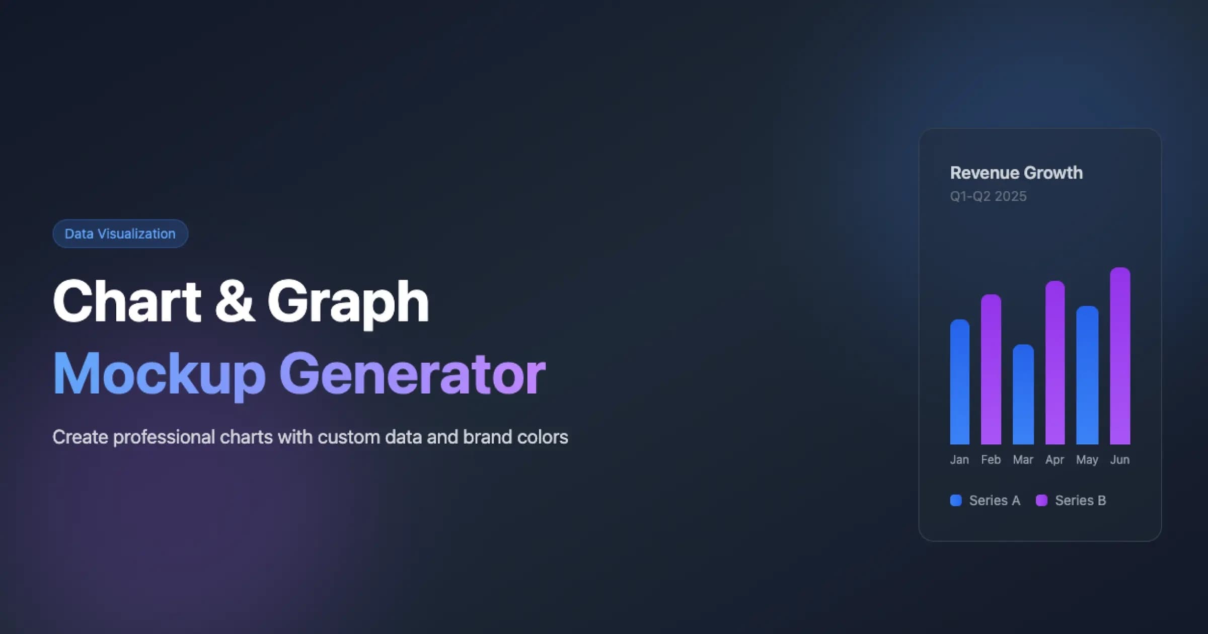
Generate professional chart and graph mockups for marketing presentations, dashboards, business reports, and data storytelling. Easily create customizable bar charts and line graphs with your own data, apply brand colors, and download as high-resolution PNG or scalable SVG for impactful business communication.
Loading the interactive generator…
Free marketing generators for mockups, UTMs, personas, and creative assets. Browse all generators
No sign up required. Generate content as much as you need.
Tailor the generated content to your specific needs.
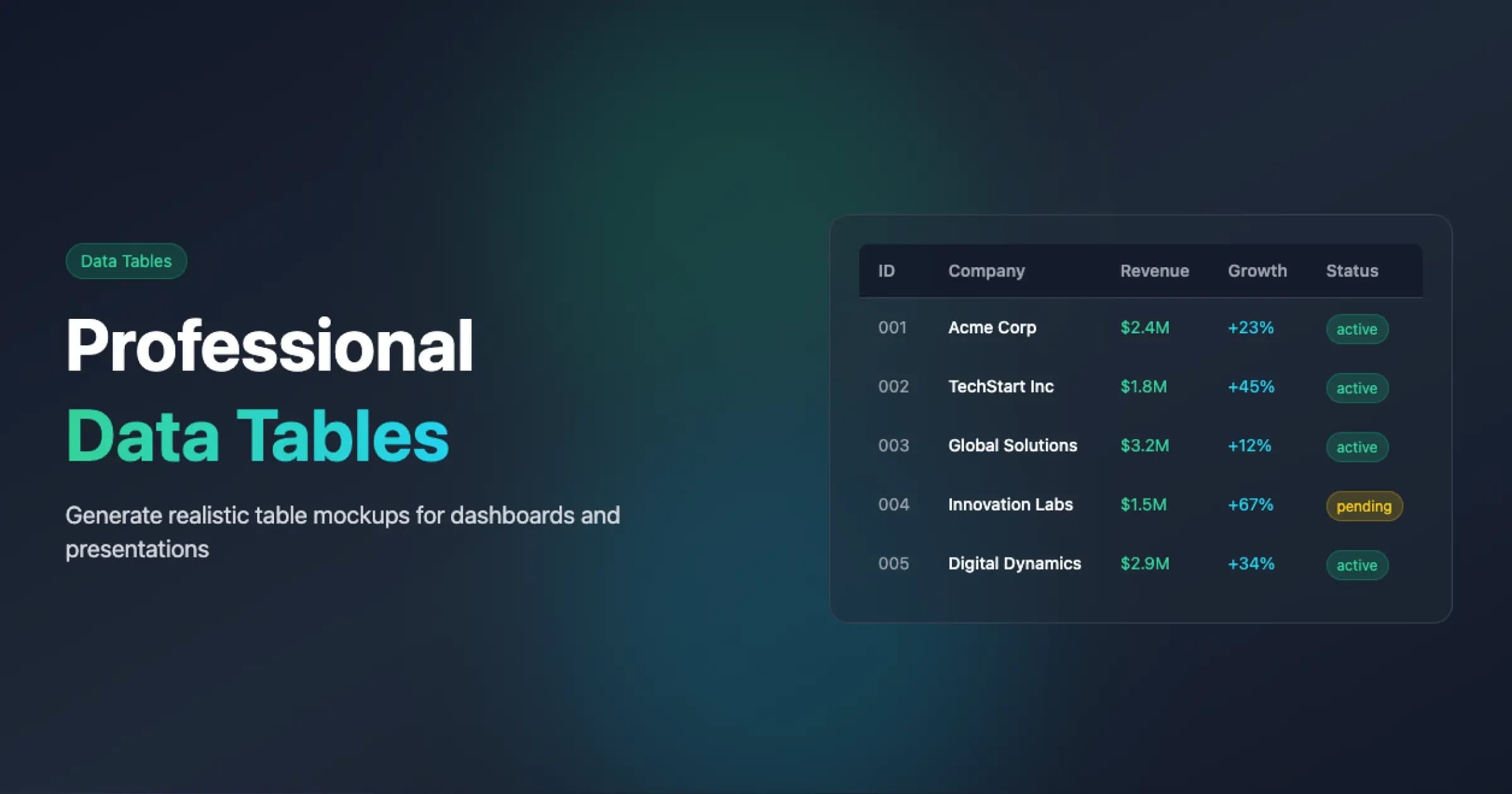
Create professional data table mockups and templates with customizable columns, sample data, and export options. Perfect for presentations, marketing materials, dashboards, and design mockups that require clean, structured data visualization. Download the raw data as CSV or the styled table as a PNG deck asset, and preview your design in real time.

Generate stunning browser window mockups with Chrome, Safari, and Firefox frames. Perfect for SaaS product launches, marketing decks, landing pages, and investor presentations. Customize gradients, shadows, and styling for professional, high-impact visuals—no design skills required.

Generate professional review and testimonial mockups for Google Reviews, App Store, and Yelp. Create clean, customizable review visualizations for landing pages, presentations, social proof, and marketing materials, then download a retina-density PNG with one click for your brand assets. Enhance trust and boost conversions with authentic-looking testimonials tailored to your brand.
A line chart is a fundamental data visualization that displays data points connected by straight line segments, primarily used to show trends, patterns, and relationships over a continuous interval like time. The chart plots data points on a coordinate system where typically the x-axis represents the independent variable (often time) and the y-axis represents the dependent variable, with points connected in sequence to form a continuous line. Line charts excel at showing rate of change, direction, and patterns in continuous data.
Area charts are graphical representations where the area between a line connecting data points and the axis is filled, emphasizing the magnitude of change over time. They're particularly effective at showing cumulative totals, part-to-whole relationships, and visualizing the volume of trends rather than just their direction.
Radar charts (also known as spider charts or web charts) represent multivariate data on axes starting from the same point and extending outward. Each axis represents a different variable, and data points are plotted along each axis and connected to form a polygon. This allows for easy comparison of multiple variables across different categories or observations.
Loading the interactive generator…
Free marketing generators for mockups, UTMs, personas, and creative assets. Browse all generators
AdSights Insights
Spend vs. pipeline generated
